Designing Scalable Mall Websites
Transforming mall websites into accessible, mobile-first tools for discovery, planning, and navigation.
Problem Statement
Many shopping mall websites fail to deliver clear, user-friendly experiences that help visitors find what they’re looking for quickly, especially basic but critical information like mall hours, store details, and promotions.
Solution Statement
We designed and maintained a system of responsive, accessible mall websites that prioritized real visitor needs, including clear store directories, mobile-friendly layouts, and key information up front, while keeping the design system efficient to scale and update.
We studied real user behavior across mall websites to understand how people search for information like hours, store details, and promotions.
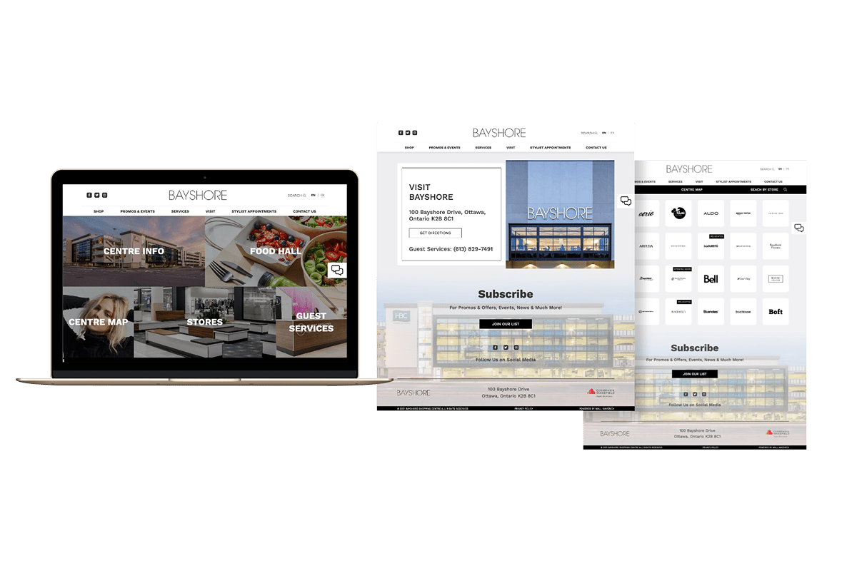
We developed a modular system that allowed layouts and components to adapt to each mall’s branding while maintaining consistency and usability.
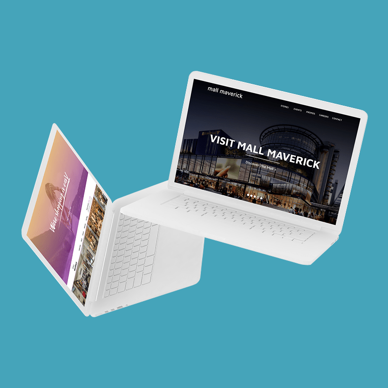
We created a clean, responsive interface that highlighted essential user tasks and scaled seamlessly across desktop and mobile devices.
Our system enabled fast handoff and easy content updates, allowing mall teams to keep sites fresh and accurate without breaking the design.
Overview
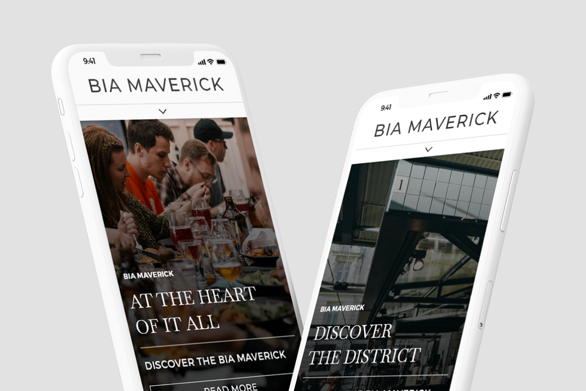
During my time at Mall Maverick, I designed and launched websites for dozens of malls across North America. These weren't standalone projects—they were part of a centralized system that balanced user experience, performance, and ease of maintenance.
Each website needed to reflect the unique branding of the mall while following a clear structure that helped real visitors accomplish everyday tasks. From initial research through final delivery, I led the UX effort to make these websites accessible, mobile-ready, and easy to scale.
Role & Responsibilities
As lead UX Designer, I managed the full design process, conducting user research, building responsive UI systems, collaborating with developers, and ensuring accessibility standards were met.
I worked closely with developers, project managers, and content editors to deliver each website on time and aligned with both user and business needs.
User Research & Insights
User data showed that mall visitors primarily used the websites to check mall hours, view store-specific hours, and browse store directories and events.
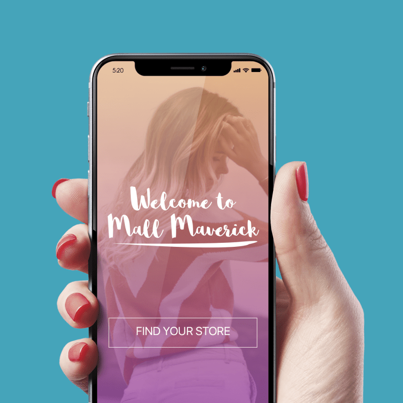
Visitors often accessed the sites on mobile and expected fast, clear answers without needing to dig through menus. These insights shaped our decisions around content hierarchy, layout, and navigation.
UX Goals
Our goal was to create mall websites that delivered essential information quickly, adapted easily to different content needs, and remained consistent across properties without sacrificing usability.
We focused on making mall and store hours easily accessible, designing layouts that could scale across a wide range of mall types, ensuring strong mobile performance and accessibility, and building a reusable system that made future launches faster and more efficient.
Design Process
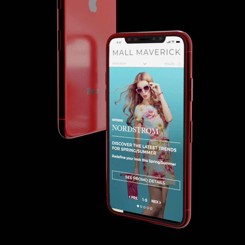
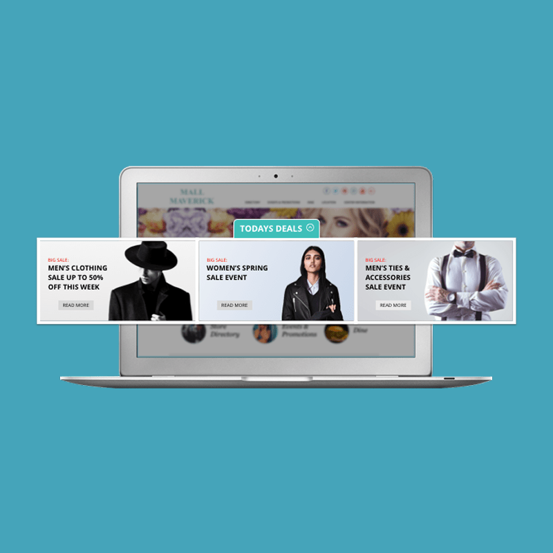
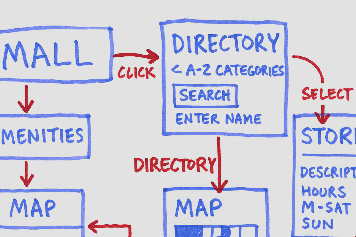
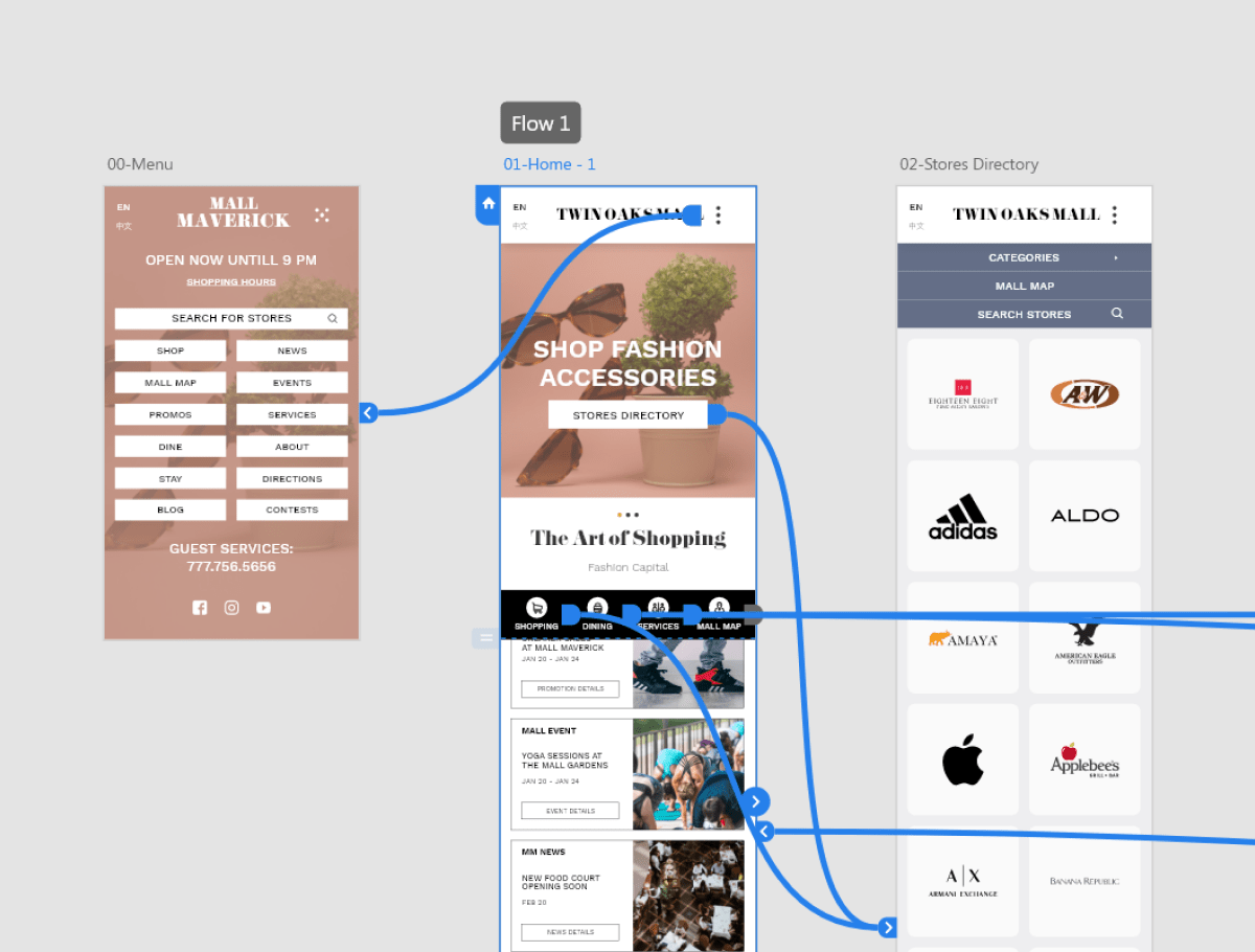
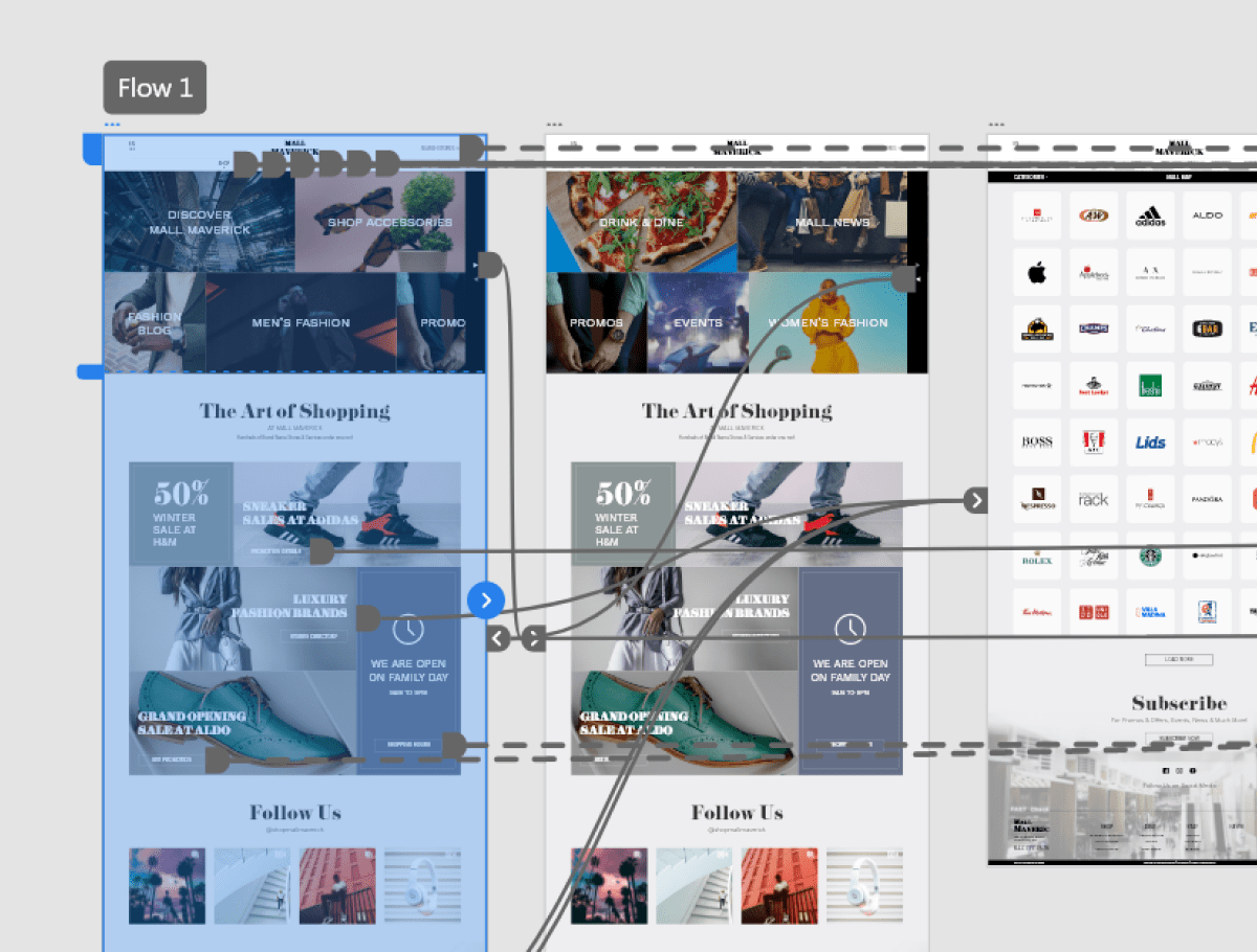
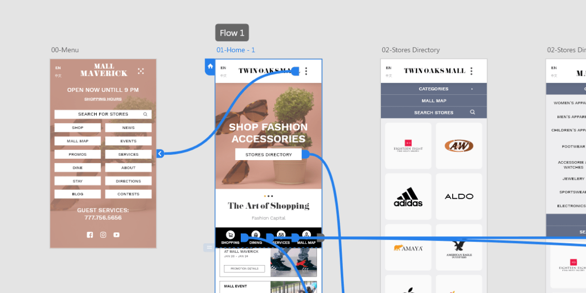
We began with modular wireframes designed to accommodate various mall content needs while keeping the user experience consistent. Components like store cards, event sections, and promotional banners were built to be flexible and reusable.
Typography and spacing were optimized for readability, especially on mobile. The entire system was tested and refined based on analytics and feedback, ensuring a layout that supported both daily shoppers and seasonal campaigns.
Key Features
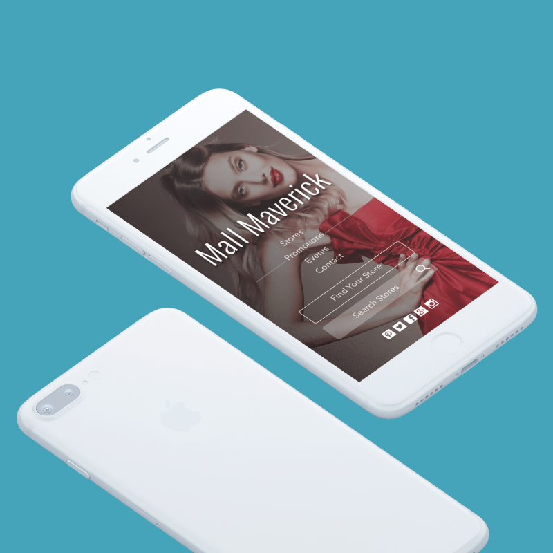
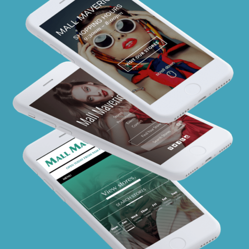
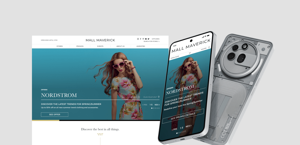
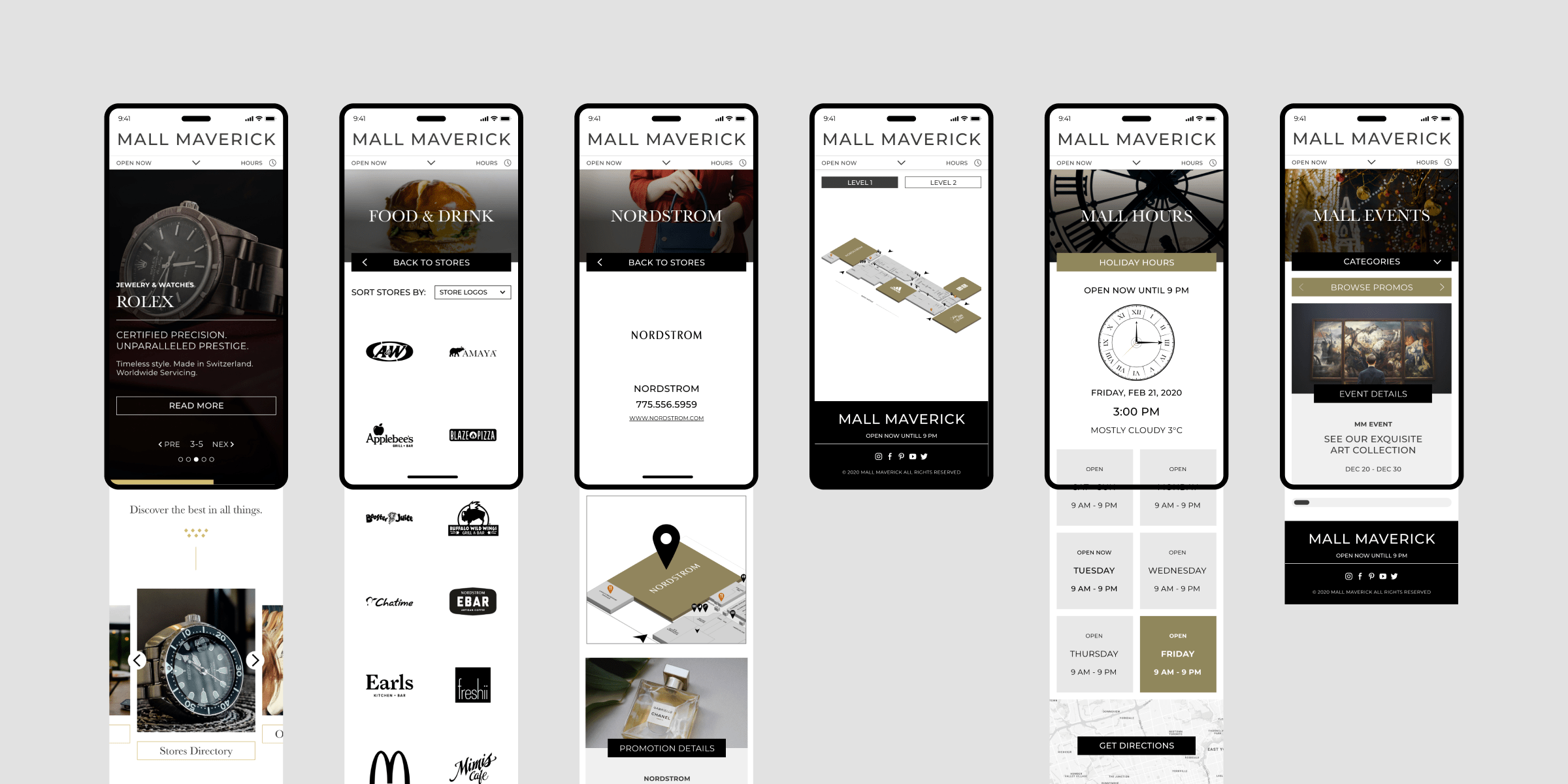
We started with low-fidelity wireframes to test content hierarchy and layout logic. Key decisions included placing opening hours at the top of the page with a live status indicator and grouping key actions—Find a Store, View Events, and Map—above the fold.
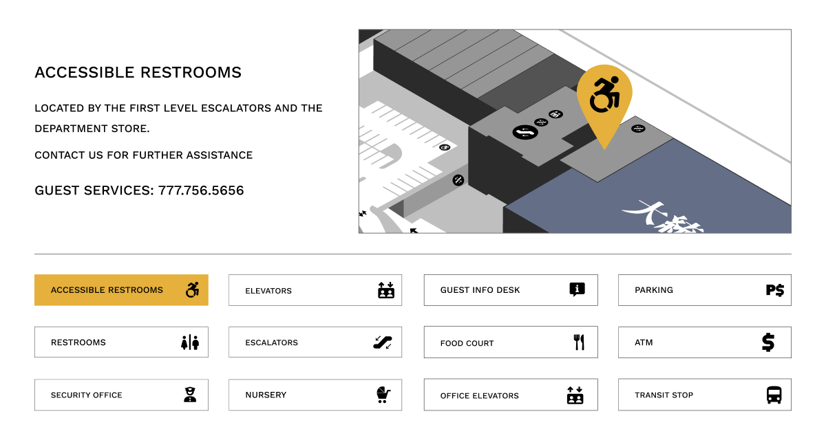
High-fidelity designs followed, using a clean, neutral UI system that could flex based on each mall's branding. Store pages were standardized to include hours, location, promotions, and logos. Event listings were redesigned to be visual and scrollable, making them easier to scan on mobile. The interactive map used SVG with tap/click zones per store and a floor toggle, offering users an intuitive way to orient themselves.
Accessibility
Accessibility was a core focus throughout the design process. We ensured all text met WCAG contrast standards, incorporated clear focus states for keyboard navigation, and structured content with semantic HTML and ARIA labels for screen readers.
Interactive elements were optimized for touch with appropriate tap targets and spacing, making the experience seamless across devices and assistive technologies.
Outcome & Impact
After launch, engagement increased across all redesigned sites. Users stayed longer on key pages, bounce rates dropped, and marketing teams reported fewer support calls related to hours and directions.
The opening hours feature was particularly impactful—users now had a reliable source they could trust, which was crucial during holidays and special events. By turning the website into a functional tool, we elevated its value both for visitors and for mall management.
Goals
Our goal was to create mall websites that delivered essential information quickly, adapted easily to different content needs, and remained consistent across properties without sacrificing usability.
- Prioritize easy access to mall and store hours
- Design layouts that scale across multiple malls
- Ensure strong mobile performance and accessibility
- Build a reusable system to streamline future launches
Accomplishments
We successfully met our targets and created a compelling interface.
- Successfully launched 30+ mall websites using a shared framework
- Reduced design and development time per project
- Improved task completion rates for mobile users
- Received positive client feedback on clarity and flexibility