The Case For Focus States in Design System Components
Why your components should have focus states and how to implement it in Figma
Problem Statement
Many design systems overlook focus states, leading to accessibility gaps and inconsistent user experiences, especially for keyboard and assistive technology users. Without clear focus indicators, navigating interfaces becomes difficult and error-prone, and developers are often left without guidance on how to implement them.
Solution Statement
We established a standardized method for integrating accessible focus states directly into Figma components. This approach ensures WCAG compliance from the design stage, improves usability for all users, and streamlines handoff to developers by making focus styles a visible, reusable part of the design system.
Start with user insights instead of assumptions to build solutions that truly address market needs.
Define structured user journeys to align features with needs and reduce friction points.
Create a scalable visual identity and component library that ensures consistency across platforms.
Test with interactive prototypes early to gather feedback and avoid costly development mistakes.
Why Focus States Matter for Accessibility
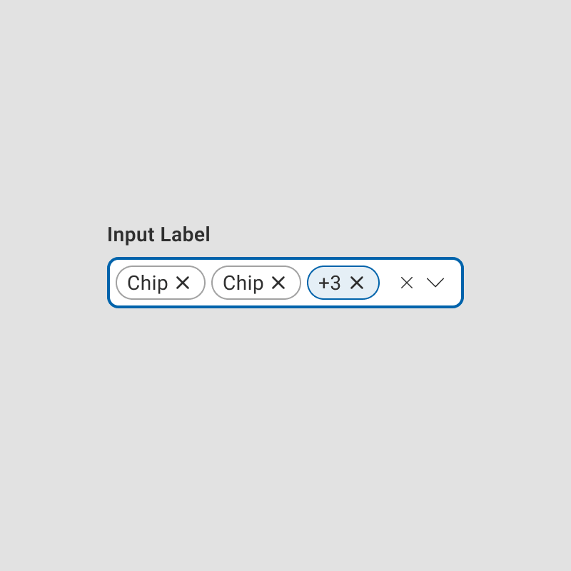
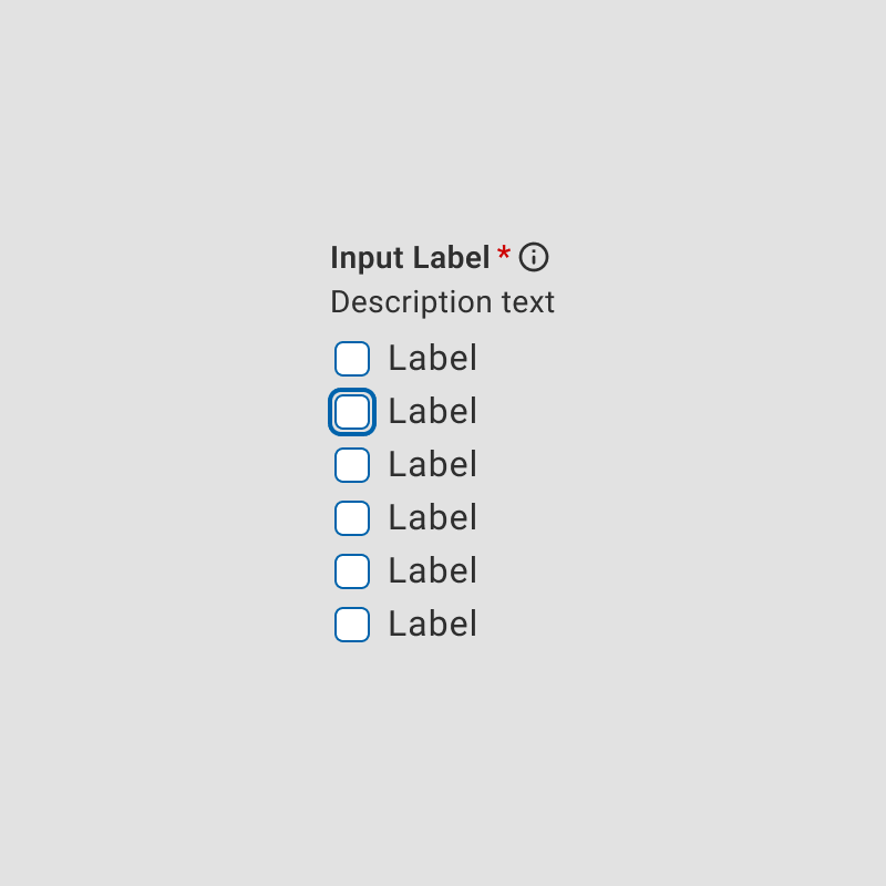
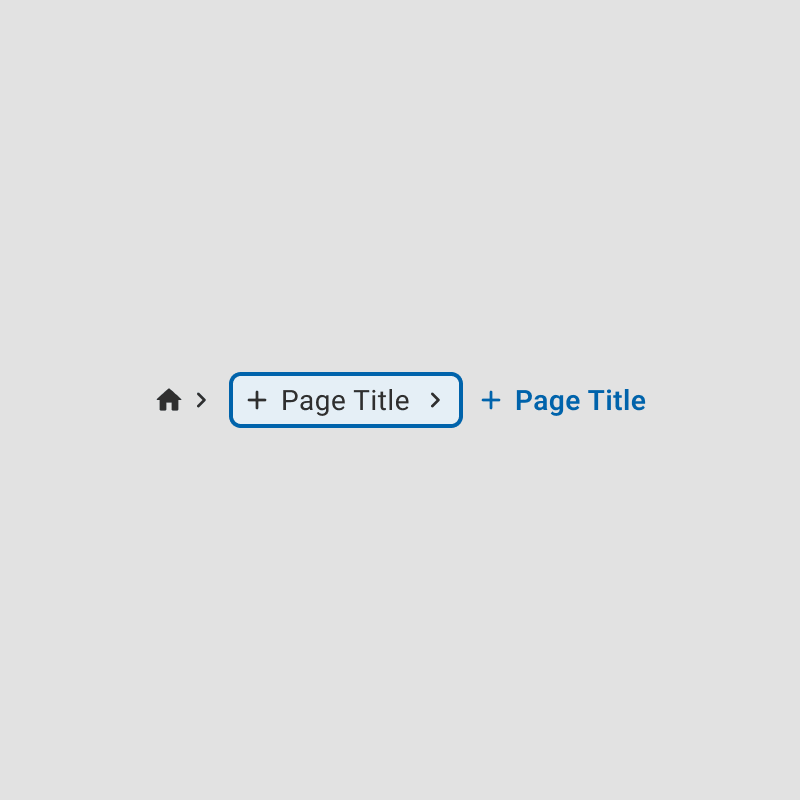
A focus state is a visual indicator, such as a border or outline, that highlights which element on the screen is currently active.
Focus states are especially critical for users navigating interfaces using keyboard shortcuts, assistive technologies, or custom input devices.
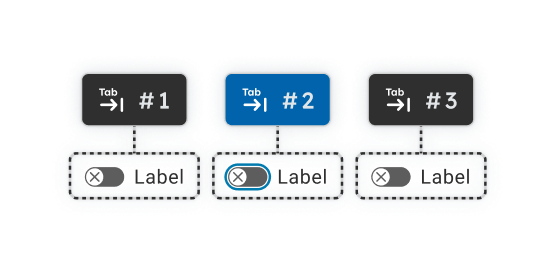
Pressing the Tab key moves the focus to the next interactive element on the screen, ensuring users can clearly identify and interact with their intended element.
Why Focus States Matter in Figma Components
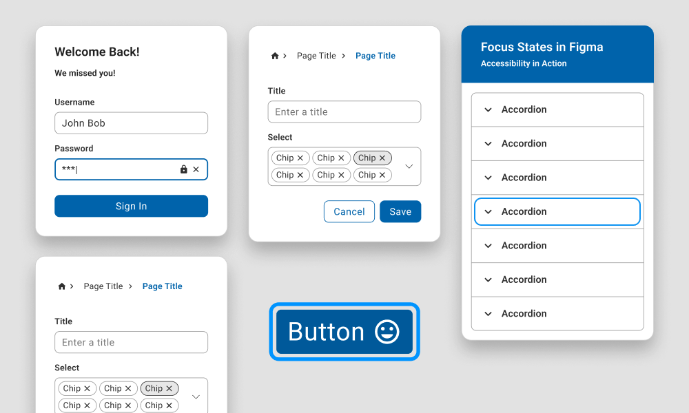
Accessibility Compliance
Focus states are essential for meeting WCAG standards, ensuring designs are accessibility-compliant right from the initial stages.
Streamlined Prototyping
Built-in focus states make it easier to simulate keyboard navigation and user interactions in prototypes, saving time and ensuring designs are functional and user-friendly.
Efficient Developer Handoff
Predefined focus states provide clear guidance for developers, reducing misunderstandings and ensuring accessibility requirements are implemented correctly without back-and-forth revisions.
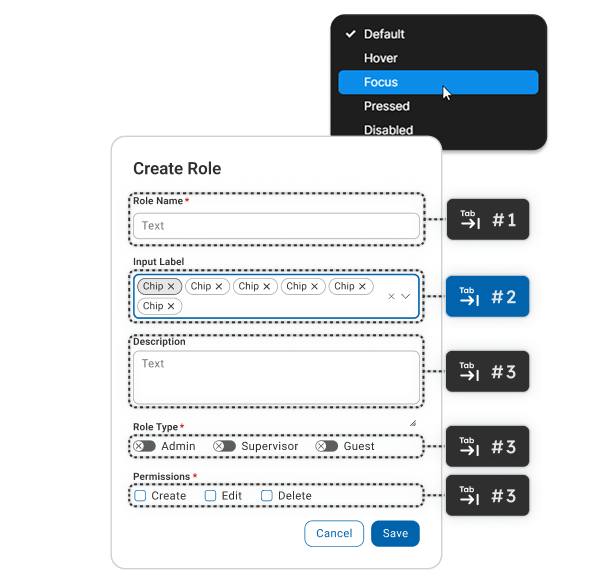
Improved User Navigation
Focus states guide users through interfaces, making navigation intuitive and reducing cognitive load, particularly in complex or form-heavy designs.
By embedding focus states in Figma components, design teams can create more accessible, efficient, and polished workflows.

The Technical Challenges of Adding Focus States to Figma Components
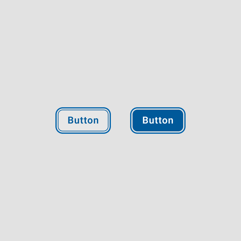
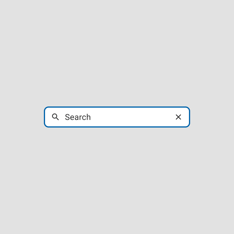
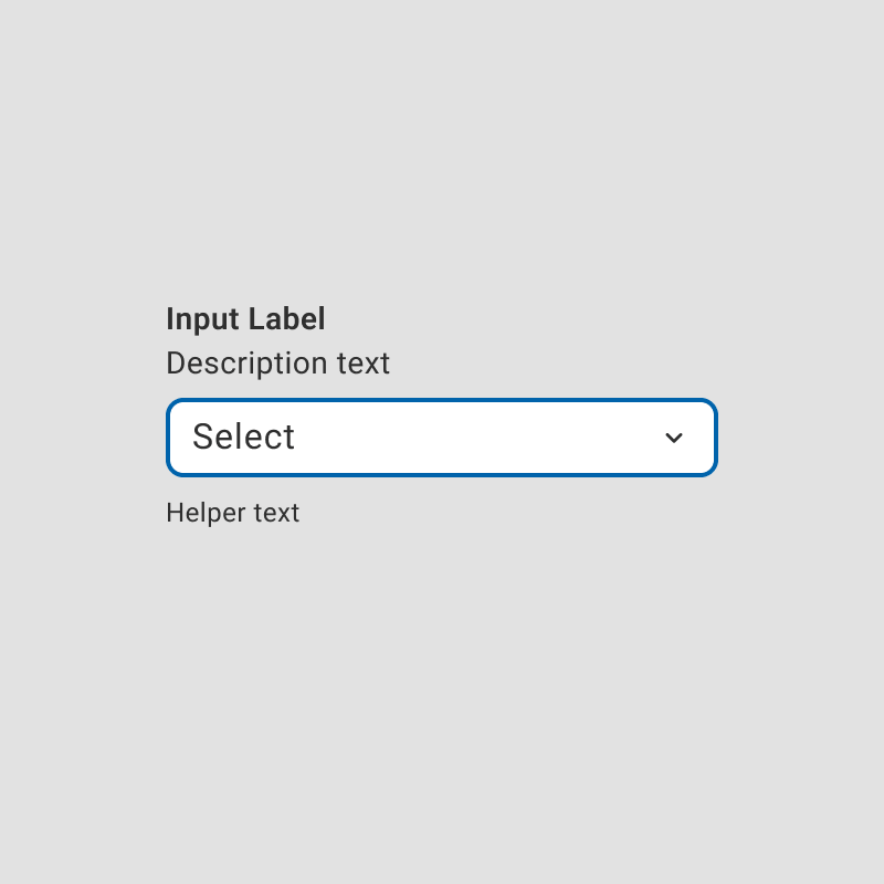
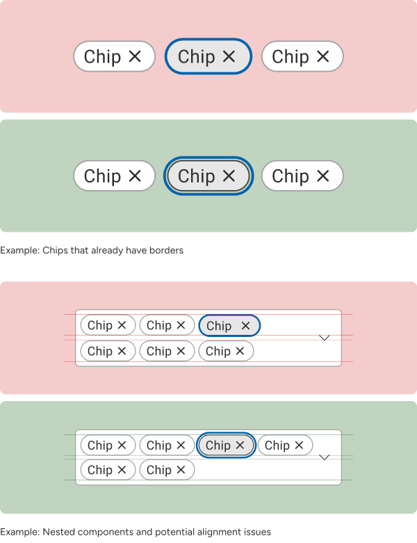
Conflict with Existing Borders
Focus states are essential for meeting WCAG standards, ensuring designs are accessibility-compliant right from the initial stages.
Nested Component Limitations
Components nested within other components can make it challenging to apply focus rings without affecting the parent's layout or design. Adjusting focus states might require detaching instances, reducing the efficiency of reusable components.
Visual Overlap
Focus states that rely on outlines or shadows may visually clash with other styles, such as box shadows or glow effects, reducing clarity and usability.
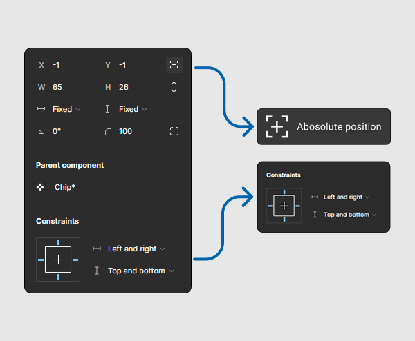
How To
By leveraging Figma's absolute positioning feature and object constraints, focus rings can be integrated seamlessly into components. This approach ensures that focus states do not alter the spacing or alignment of elements and remain independent of other styles, such as borders, preventing any conflicts or visual inconsistencies.
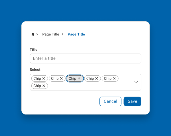
How to Implement Focus States in Figma Components
Step 1
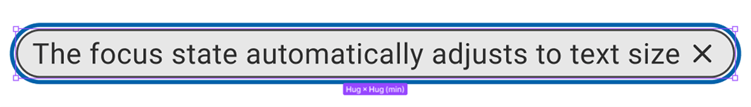
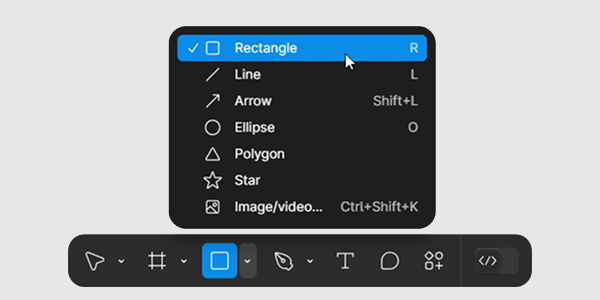
Create a rectangle inside the component (or use a duplicate variant) to serve as the focus border. Position it so that it does not interfere with existing content.
Step 2
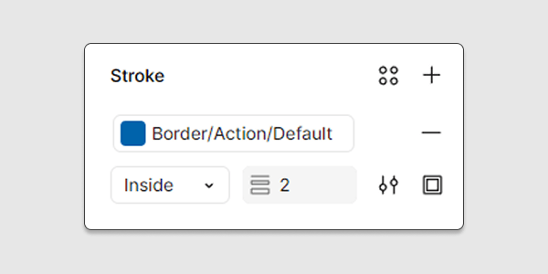
Remove the default fill of the rectangle and apply the desired focus border styles to its stroke. Use your designated color variant for a focus border.
Be Patient...
The component might look off at first—but proper absolute positioning and constraints will fix it.
Step 3
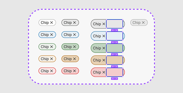
Position the rectangle so that it provides even spacing on all sides without overlapping other design elements.
Step 4
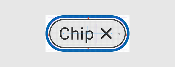
Apply absolute positioning and set constraints (left/right and top/bottom) so that the focus state adjusts with component size.
And that's how we added a focus border to an existing component without disrupting anything! This method can be applied to any component that needs a focus state.