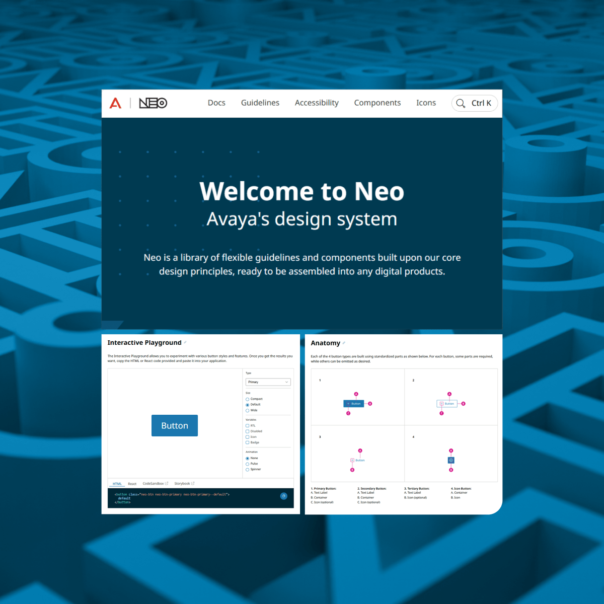
Neo Design System Optimization
A system-wide redesign to make Avaya's design system scalable, accessible, and easier to maintain.
Problem Statement
The original Neo library wasn't built for scale. As Figma evolved, the system fell behind, relying on outdated patterns and offering limited accessibility support. Developers encountered mismatches between design and code, and components were bloated and difficult to maintain.
Solution Statement
I audited and rebuilt the system from the ground up using modern Figma features, aligning components with development frameworks and design tokens. The result was a scalable, accessible, and future-proof design system.

I identified key weaknesses across the design system through a full audit of components, accessibility compliance, and developer feedback.
After surfacing recurring issues, I defined an improvement plan grounded in modern Figma capabilities, usability standards, and design system best practices.
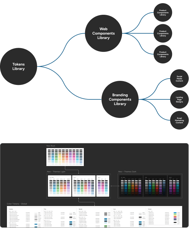
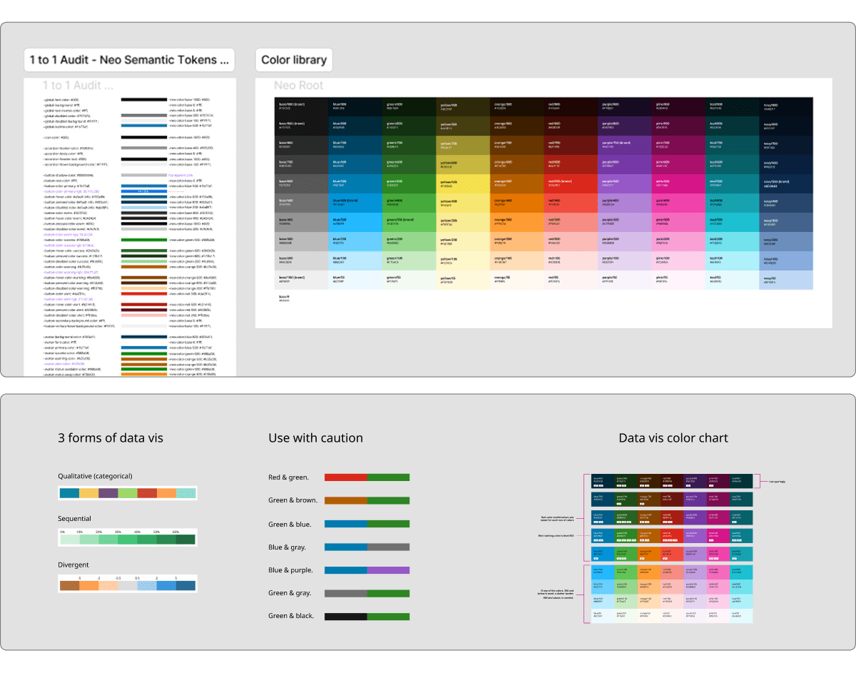
I rebuilt the library with lighter auto-layout components, centralized design tokens, and WCAG-compliant colors and typography.
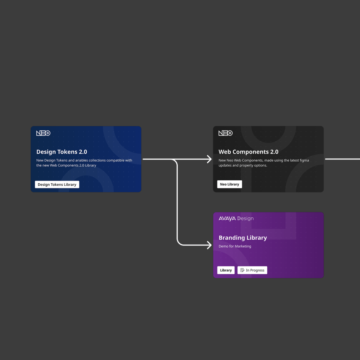
New libraries were published alongside documentation, onboarding materials, and training.
Overview
At Avaya, I was initially brought on to design admin dashboards that used the Neo Design System. As I worked more closely with the system, I saw major opportunities for improvement.
My contributions led to a new role within the Neo design team, where I helped lead efforts to overhaul the design library.
The redesign focused on accessibility, component efficiency, and alignment between design and code to support Avaya's broad product suite.

Role & Responsibilities
On the Neo design team, I led the system audit and stakeholder interviews to uncover key pain points, then planned and executed the rollout of new component libraries in close collaboration with designers, developers, and product managers.
In Figma, I rebuilt components from scratch, defined and managed design tokens, documented usage patterns, and implemented comprehensive accessibility improvements across the entire library.

Challenges
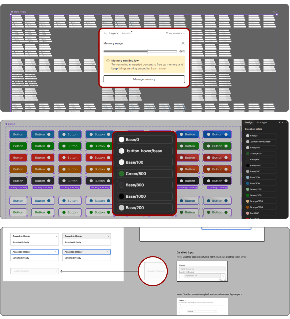
The original Web Components library wasn’t built for scale and quickly fell behind as Figma evolved.
New features like nested components, properties, and theme support were unused, leading to bloated, inefficient components.
- Components consuming excessive memory due to unnecessary complexity
- Accessibility gaps in text contrast, sizing, and keyboard support
- Text content not retained when swapping components
- Poor use of auto-layout, making updates difficult
- Reliance on global styles instead of tokens, causing color inconsistencies
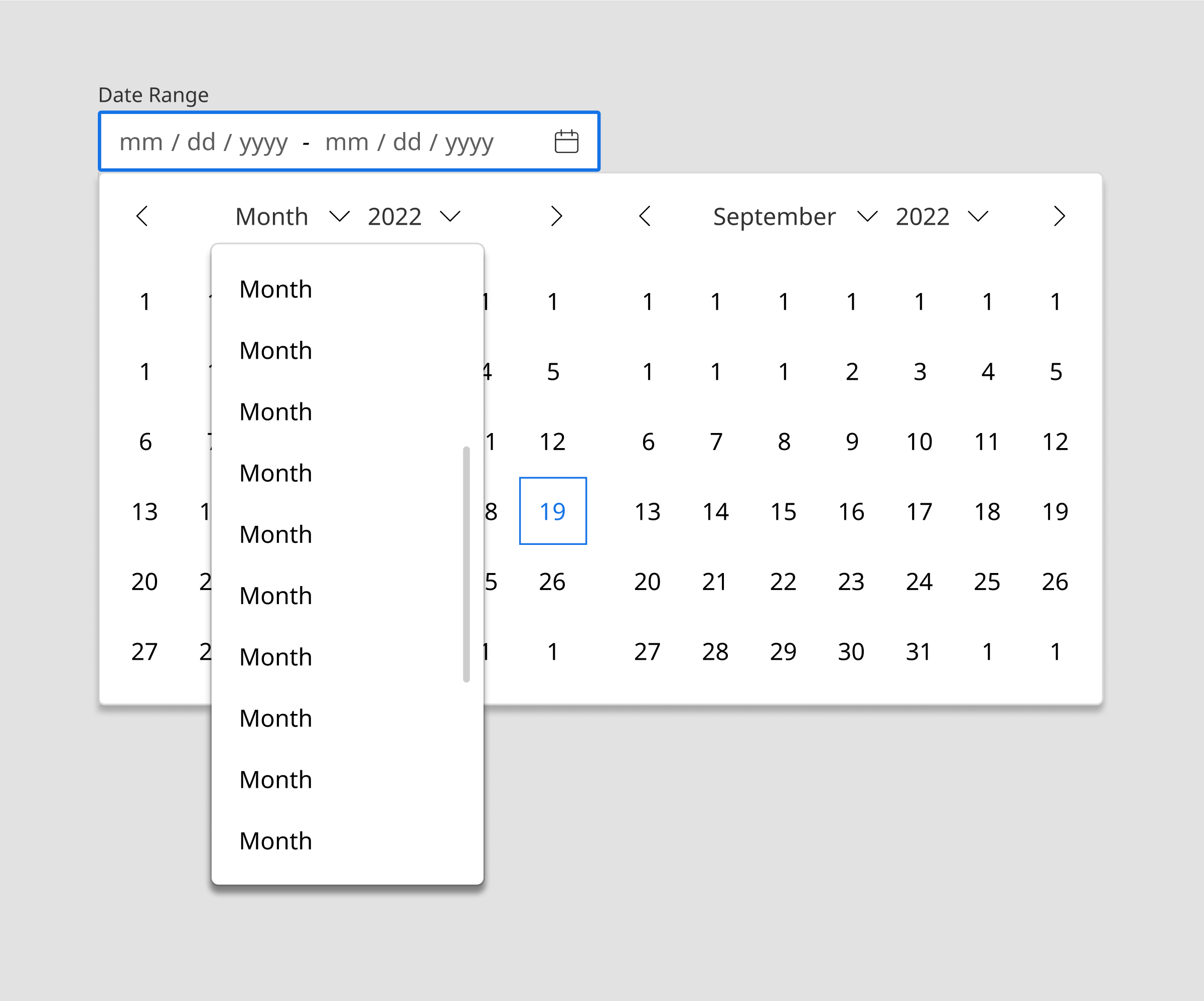
- No theme support, blocking dark mode implementation
UX Goals
My goals were to bring the system up to modern standards, make components lighter and more usable, and ensure full accessibility compliance. I also aimed to bridge the gap between design and code with scalable token use and Figma-to-React alignment.
I also aimed to deliver a fast, accessible, and future-ready system that simplified the designer and developer experience.
- Improve performance and reduce crashes
- Make accessibility compliance effortless and built-in
- Bridge design–dev collaboration through token alignment
- Build flexible, themeable, and scalable components
- Enable designers to work faster without manual rework
Strategy and Approach
I took a structured, low-disruption approach to updating the Neo Design System. After auditing all components, I worked closely with designers and developers to surface key pain points. From there, I planned improvements that aligned with best practices and modern Figma capabilities.
The rollout was designed to fit into existing workflows, making the transition intuitive and easy to adopt across teams.
- Engage with stakeholders, including designers and developers, to gather feedback and pinpoint pain points
- Research industry best practices to align updates with modern design system standards
- Develop a structured rollout plan to implement updates without disrupting ongoing work
- Ensure seamless adoption by making improvements intuitive and easy to integrate into existing workflows
Design Process
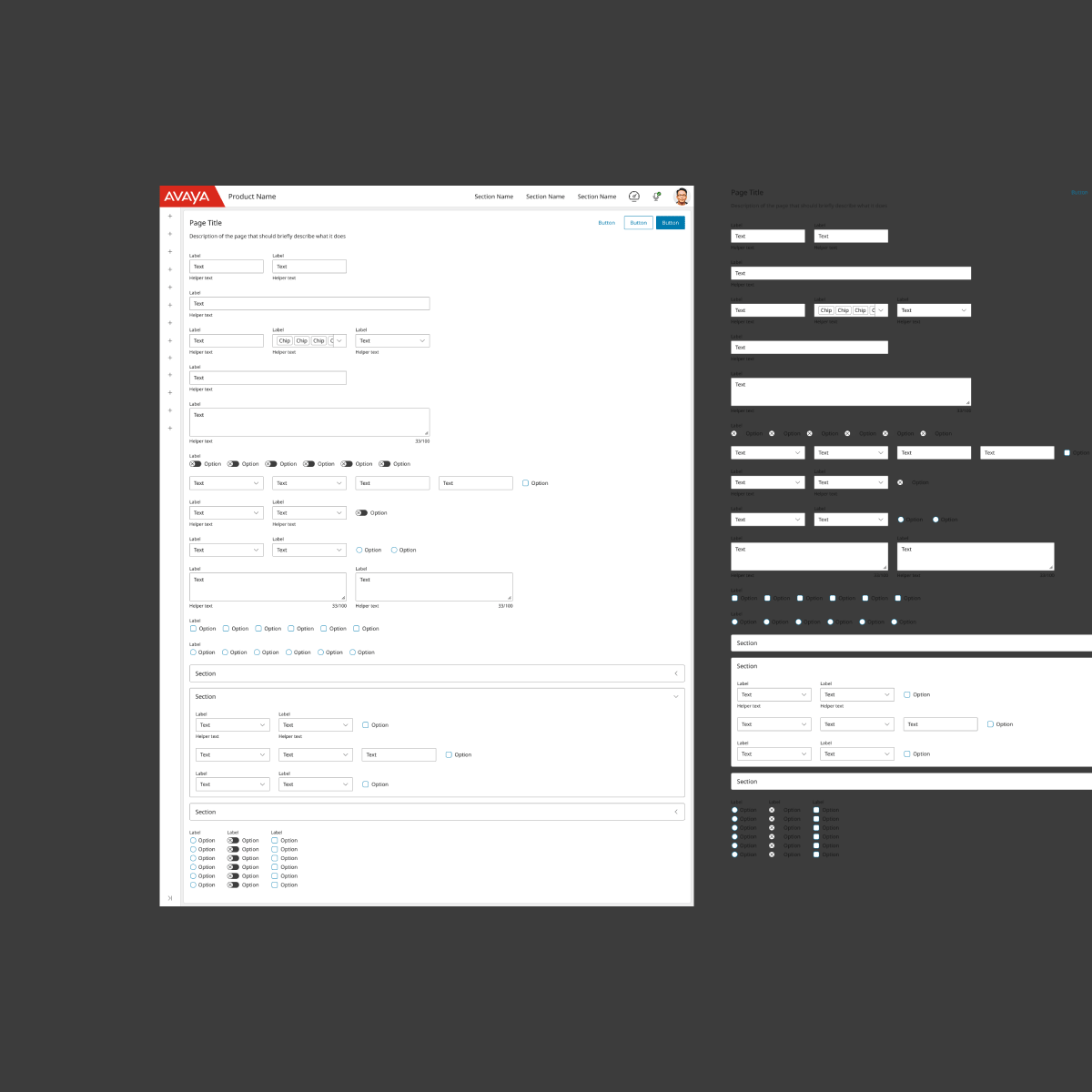
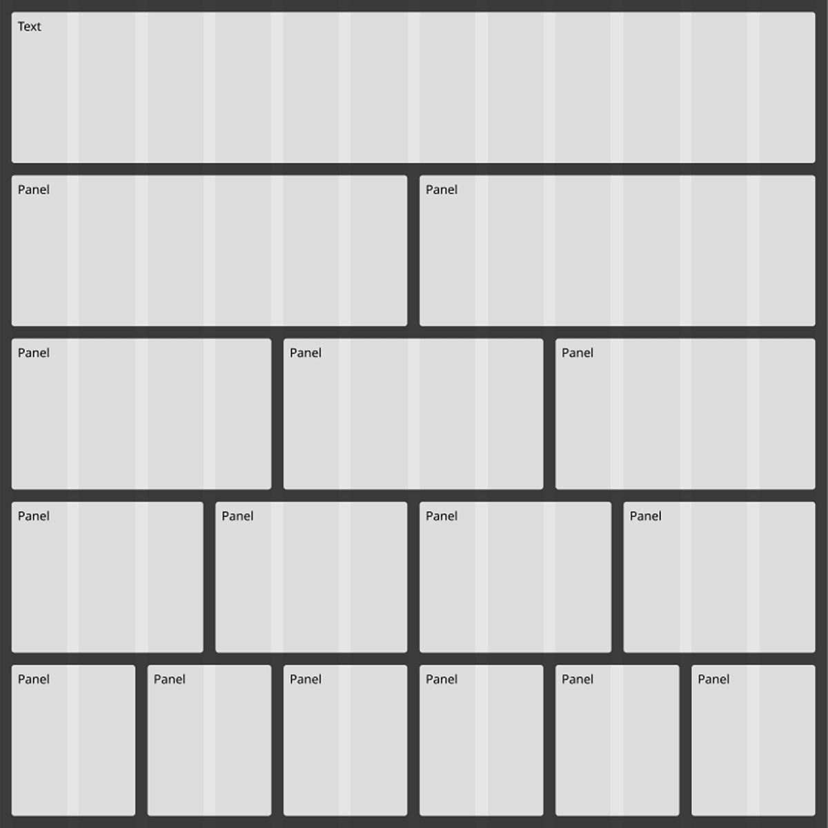
I started with a full inventory audit, then rebuilt the entire Web Components library using auto-layout, component properties, and optimized structures.
I created a separate token file to manage themes and shared variables. I prioritized text preservation and token retention to reduce manual rework.
I tested every component against WCAG Level AAA for contrast and text size, and I reviewed and updated keyboard-focus patterns.
Wireframing, Prototyping & Documentation
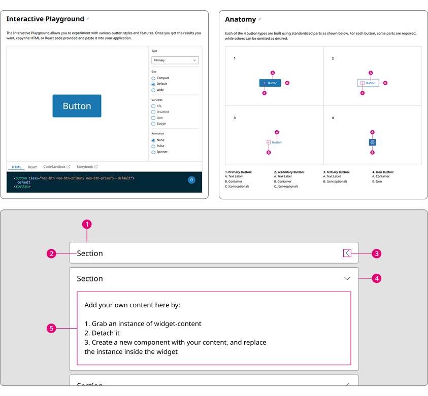
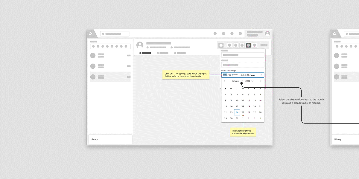
To support adoption and reduce ambiguity, I created detailed documentation and prototypes alongside the updated components.
These resources helped teams visualize usage, test interactions, and apply components correctly in their own workflows.
- Wireframes using the new components to define layout patterns
- Clickable prototypes showing interactive behavior across states
- User flows and task-based documentation to map usage scenarios
- Embedded component documentation within the Figma file for quick access
Key Features
Key features included a centralized token system, theme support, WCAG compliance, and rebuilt components using auto-layout and atomic principles for easier updates and scalability.
- Fully rebuilt system with modular, lightweight components
- Auto-layout used consistently for responsiveness
- Centralized design tokens for easy theming and updates
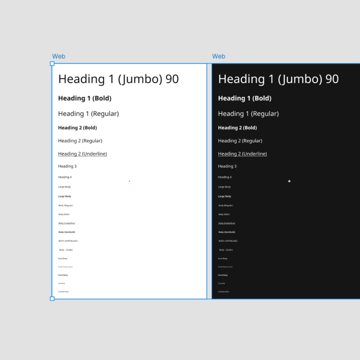
- Light/Dark mode toggle support across the full system
- Accessibility baked in at every level
Accessibility
I always advocate for accessible design, prioritizing inclusive usability for every user.
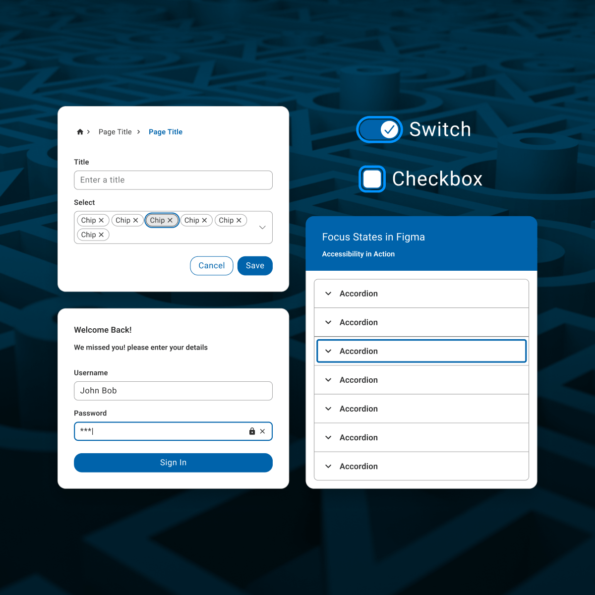
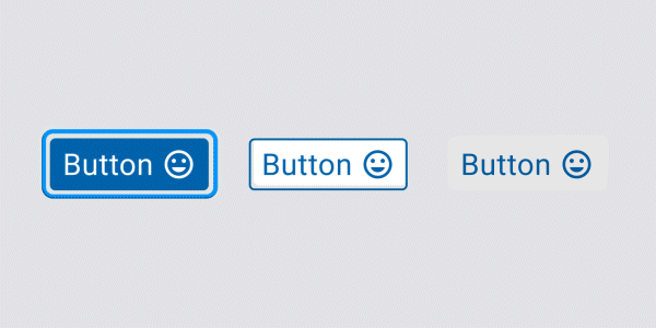
Accessibility was a core part of my redesign. I audited all components for text contrast, minimum sizing, and keyboard support. I updated patterns to meet or exceed WCAG Level AAA and built those patterns into every reusable component.
I also added focus states across all components to match their coded counterparts, ensuring visual indicators for keyboard navigation were consistent and accessible. These enhancements improved usability for all users and aligned the Figma library with front-end accessibility standards.
Outcomes
The Neo redesign delivered rapid, organization-wide benefits in performance, accessibility, and adoption, empowering teams to work faster and more inclusively.
- Performance & Efficiency: Figma load times fell by ~40% and library size shrank by ~35%, enabling designers to iterate up to 30% faster.
- Accessibility & Quality: Achieved 100% WCAG AA compliance with built-in focus states, driving a ~90% reduction in keyboard-navigation issues.
- Responsive & Flexible: Applied auto-layout to every component, ensuring they adapt fluidly to varying content and screen sizes.
- Adoption & Onboarding: Rolled out to eight product teams within three months and cut new-hire onboarding from three days to one, complete with default dark-mode support.

Goals
My aims were to enhance user experience and drive engagement for the platform.
- Create a scalable, theme-ready component system
- Achieve full accessibility compliance across all UI elements
- Simplify handoff and reduce dev/design gaps
- Enable faster updates and adoption across teams
Accomplishments
My work transformed Neo into a modern, accessible, and adaptable system used by teams across Avaya.
- Entire library rebuilt with auto-layout and properties
- Light/Dark theme toggle support fully implemented
- WCAG-compliant sizing and color across all components
- Centralized token file now used across libraries
- Improved adoption by both designers and engineers