Johnie Buns
A Bold New Look for a Neighborhood Favorite
Problem Statement
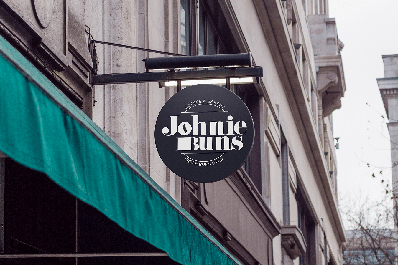
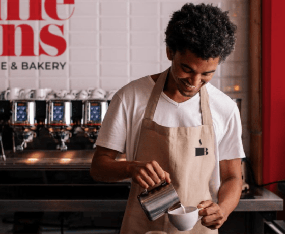
Johnie Buns needed a fresh, memorable identity to stand out in a crowded market of coffee shops and bakeries. The existing brand lacked personality, making it hard to create emotional connection or visual consistency across signage, packaging, and in-store experience. The challenge was to create a system that felt bold, welcoming, and instantly recognizable.
Solution Statement
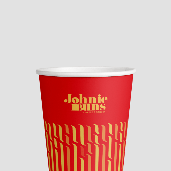
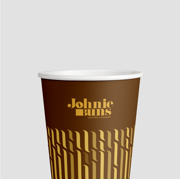
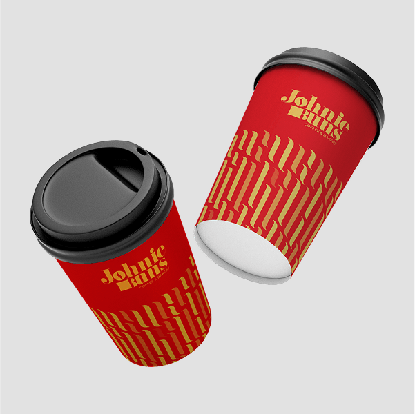
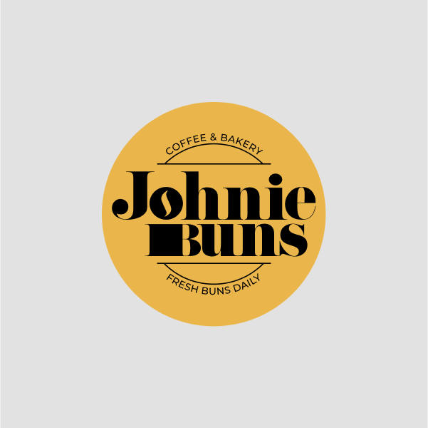
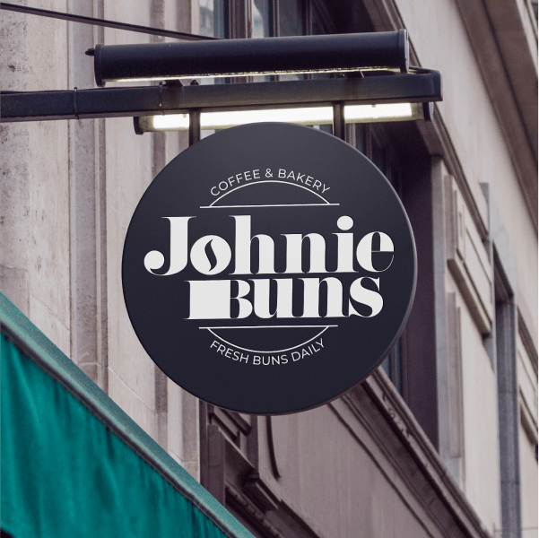
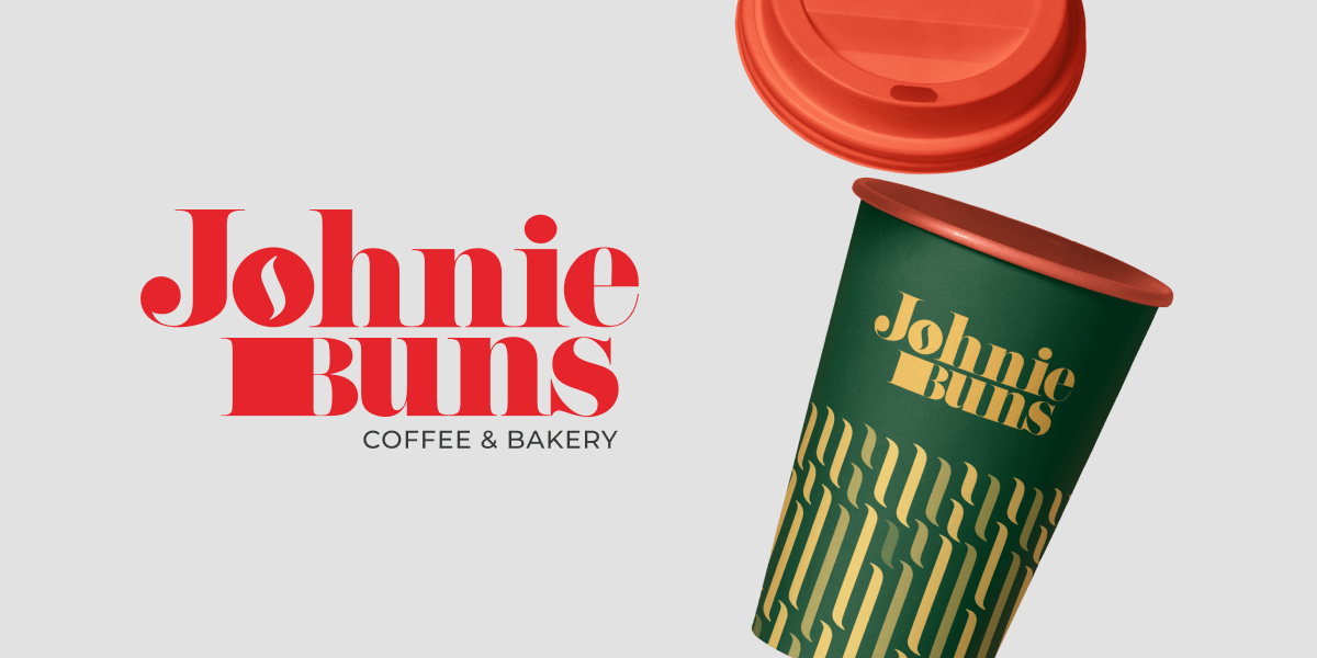
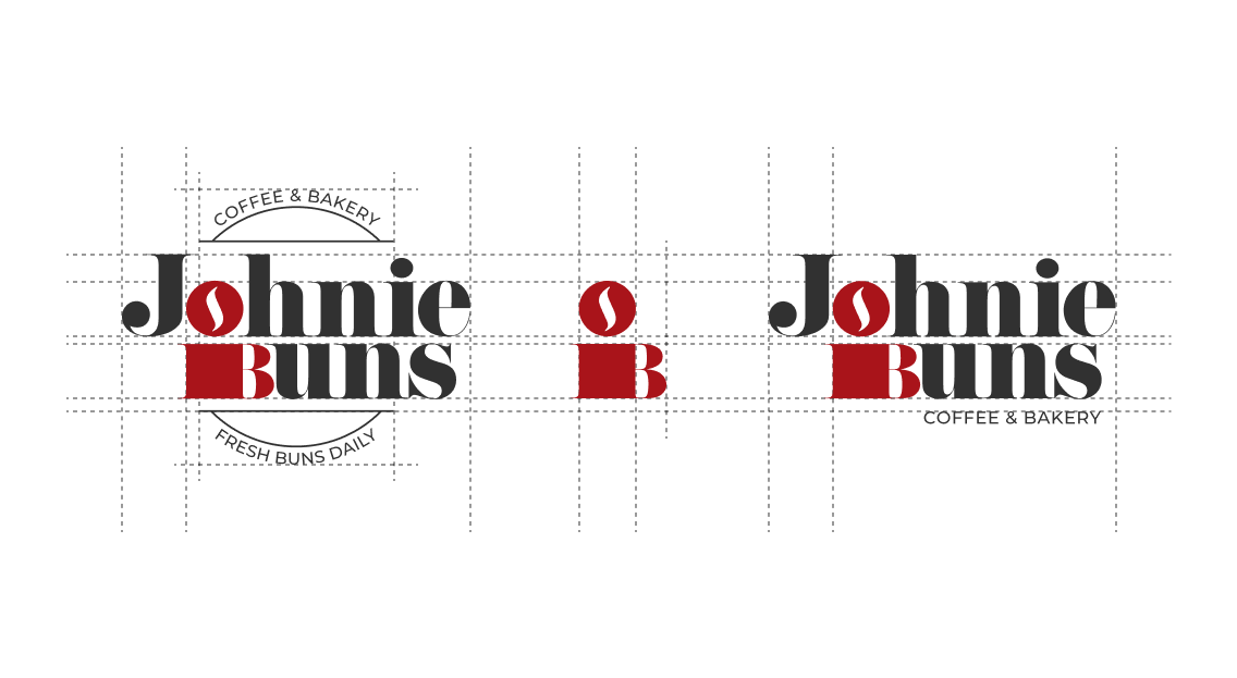
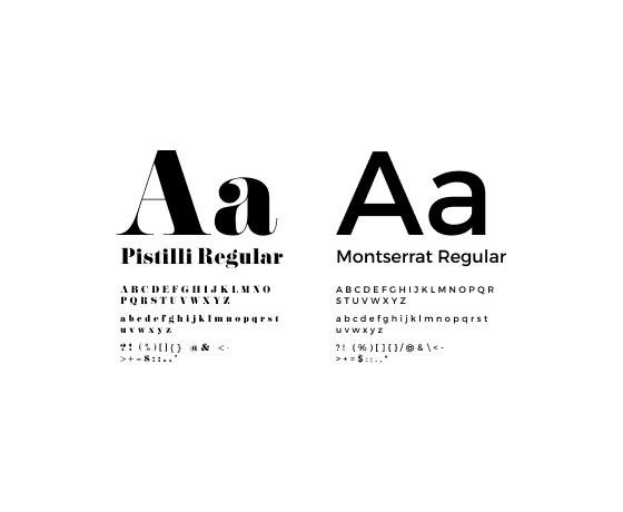
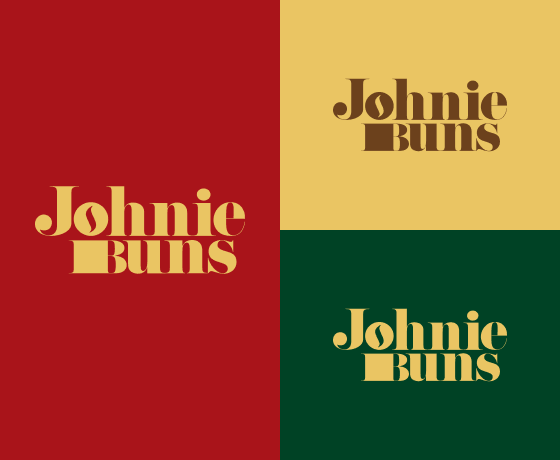
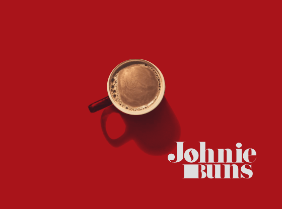
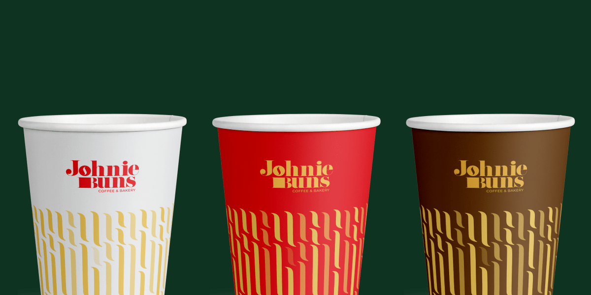
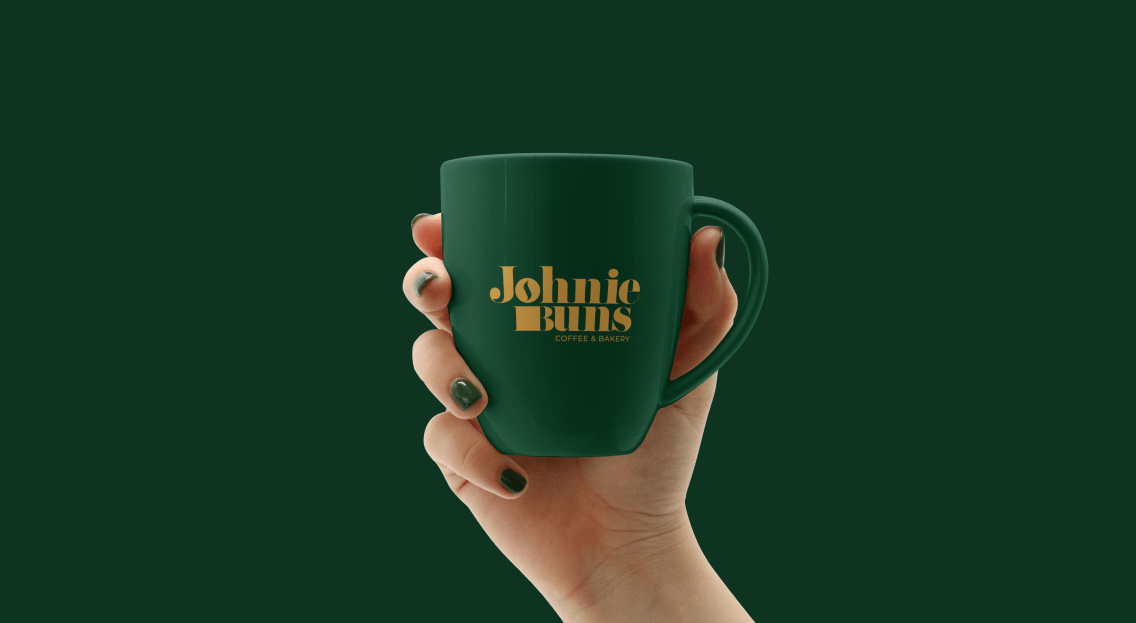
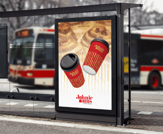
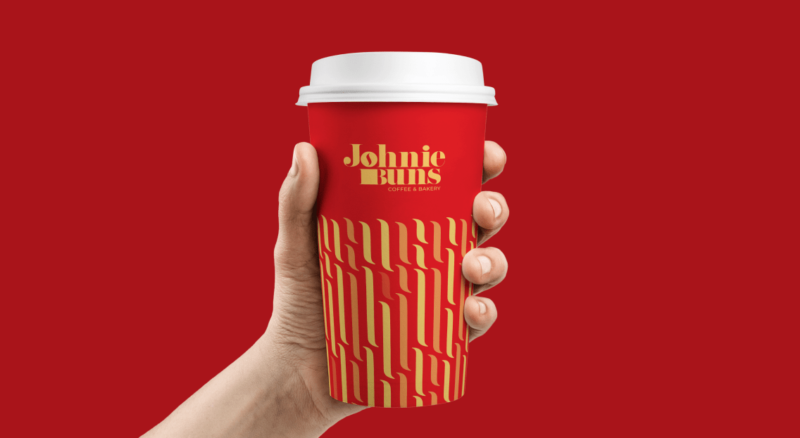
We developed a bold visual identity that blends retro charm with modern confidence. The custom wordmark, playful color palette, and rhythmic pattern system work across a range of applications—from storefronts to takeaway cups. Every element reinforces the brand’s character: warm, punchy, and full of flavor, just like the baked goods it represents.

Goals
We set out to create a brand that felt confident, flexible, and full of character, just like the bakery itself.
- Create a bold, recognizable identity that reflects the brand's playful and warm personality
- Design a flexible system that works across signage, packaging, merchandise, and digital
- Establish visual consistency for an elevated in-store and takeout experience
- Help Johnie Buns stand out in a competitive local coffee and bakery market
Accomplishments
The final identity brought cohesion, clarity, and visual impact across every brand touchpoint.
- Delivered a cohesive visual identity with a custom wordmark and retro-modern aesthetic
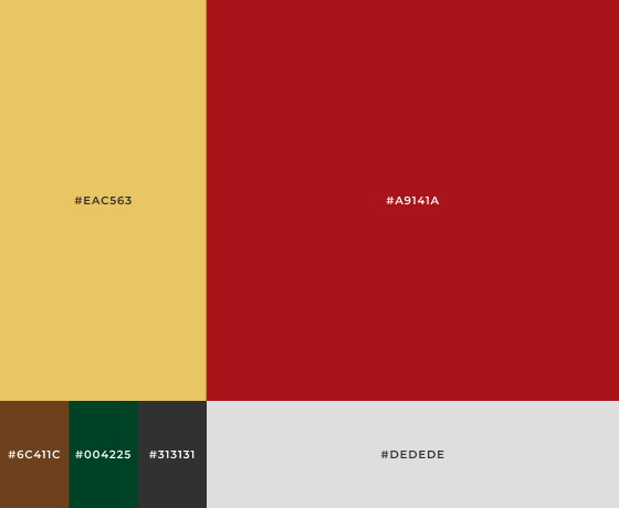
- Rolled out packaging in three brand colors for easy flavor or category distinction
- Designed scalable brand assets including patterns, signage, and merchandise
- Improved brand recognition and street presence through unified visual touchpoints