Jobeyze
Crafting a cohesive, modern visual system for an AI-powered talent acquisition platform
Problem Statement
Jobeyze was launching into an overcrowded HR tech market without a unified visual identity. Inconsistent logos, colors, and messaging made it hard to stand out, eroded brand recognition, and weakened user trust across digital and social channels.
Solution Statement
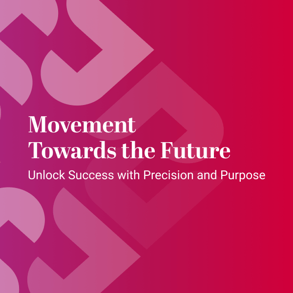
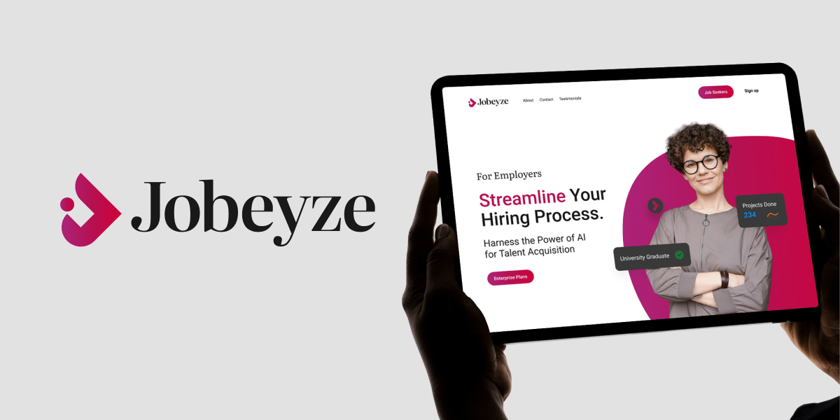
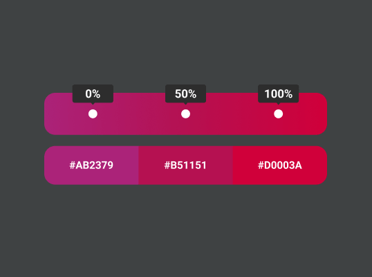
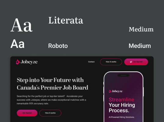
I designed a distinctive, forward-looking logo, defined a bold color palette and typography system, and produced a full set of brand guidelines. From web UI components to social-media templates, every asset was crafted to deliver a consistent, memorable Jobeyze experience.

Goals
To establish a cohesive, memorable brand identity that scales across web and social touchpoints
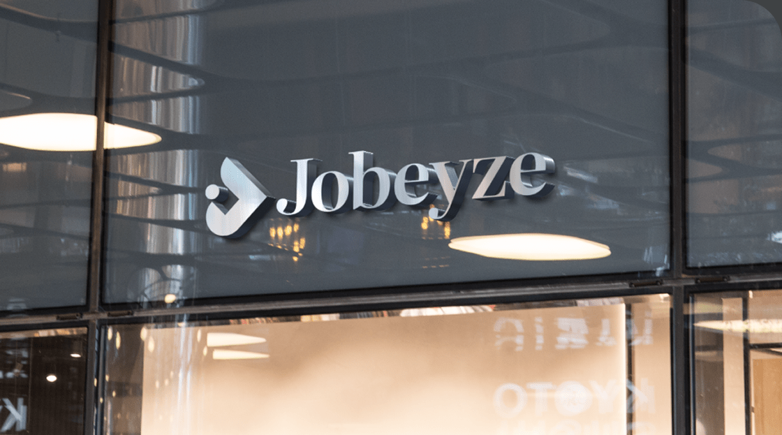
- Define a distinctive logo mark embodying connection, intelligence, and progress
- Formalize clear guidelines for color, typography, spacing, and usage
- Build a versatile library of web and social-media assets for rapid deployment
- Ensure the system scales seamlessly for internal teams and external partners
Accomplishments
I achieved these goals by delivering key brand assets and documentation
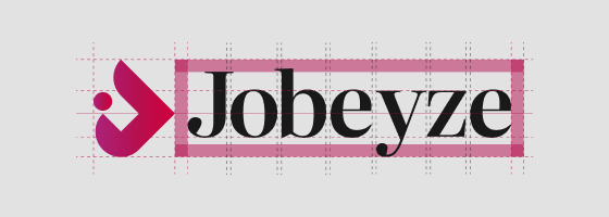
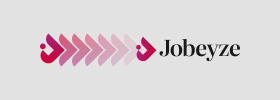
- Crafted primary and secondary logo variants with precise grid, spacing, and usage rules
- Defined a typography system pairing Literata for headlines with Roboto for body text
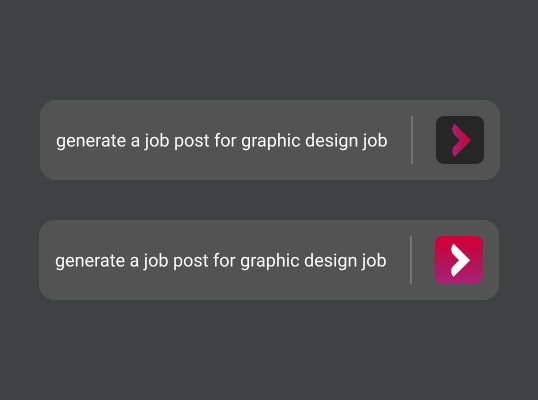
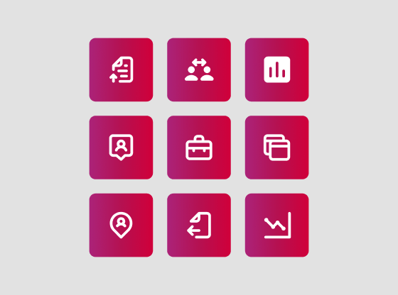
- Designed a versatile asset library—icons, buttons, and templates—for web and social media